

SPL Programming - 12.3 [Drawing graphics] More coordinate systems
We also saw a pie chart in the first section, but it seems too troublesome to describe the positions of these circles and sectors in the coordinate system. How was it drawn?
In addition to the rectangular coordinate system, SPL also provides the polar coordinate system.
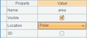
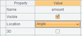
The polar coordinate system also requires two axes (plane graphics always need two axes): polar axis and angular axis. In addition to selecting horizontal and vertical axes, polar and angular axes can also be selected for the location properties of axis element:
Readers with polar coordinate system knowledge can easily understand the location properties of these two axis elements, which will not be repeated here.
Change the previous column graph to polar coordinate system:
| A | B | |
|---|---|---|
| 1 | [10,20,40,30,50] | [East,North,West,South,Center] |
| 2 | =canvas() | |
| 3 | =A2.plot(“EnumAxis”,“name”:“area”,“location”:3) | |
| 4 | =A2.plot(“NumericAxis”,“name”:“amount”,“location”:4) | |
| 5 | =A2.plot(“Column”,“axis1”:“area”,“data1”:B1,“axis2”:“amount”,“data2”:A1) | |
| 6 | =A2.draw(600,400) | |
Only the definition of the axis is modified, and the element statement in A5 is not changed at all.
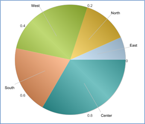
But it is drawn like this:
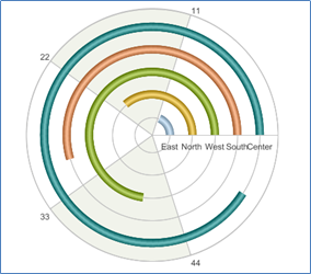
This is not what we want. But when you think about it carefully, SPL is right. It turns the horizontal axis and vertical axis into polar axis and angular axis. The position of the horizontal axis becomes the radius of the polar axis, while the value of the vertical axis becomes the angle of the angular axis. The column element has no problem in polar coordinate system.
We need to stack these “columns” in one position. We find that the element does have this property, but after using it, it draws five whole circles, which are not stacked in one position.
It turns out that the coordinate of the enumeration axis corresponds to a sequence composed of members of two sections. The former section is called category and the latter is called series. Stacking can only be between series. In fact, category and series are equivalent to two levels, but it is not easy to describe them with a two-layer sequence. It needs a table sequence with fields, which is troublesome, so SPL uses comma separated strings to describe this relationship. such as
[“USA,NY”,“USA,CA”,“USA,TX”,…,
“CHN,BJ”,“CHN,SH”,“CHN,TJ”,…,
…]
It can describe a two-tier relationship. The same in the previous section is considered to be the same category. The series under different categories can be the same or different.
In our current situation, we should regard these areas as series under one category, and there is only one category.
Adjust the code:
| A | B | |
|---|---|---|
| 1 | [10,20,40,30,50] | [East,North,West,South,Center] |
| 2 | =canvas() | =B1.(“,”+~) |
| … | … | |
| 5 | =A2.plot(“Column”,“stackType”:1,“axis1”:“area”,“data1”:B2,“axis2”:“amount”,“data2”:A1) | |
| 6 | =A2.draw(600,400) | |
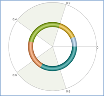
Percentage stacking shall be used in A5, which will ensure that the entire 360-degree angular axis is filled. At the same time, the data of the first axis should be changed to B2, preceded by a comma to turn the area list into a series (there is only one empty category).
Now it’s drawn like this, and it’s a little familiar. The rest is to adjust the width of the “column”, and there is a lack of indication information. These can be realized step by step.
However, it is still too troublesome. SPL directly provides a sector element, which will automatically convert category into series and stack:
| A | B | |
|---|---|---|
| … | … | |
| 5 | =A2.plot(“Sector”,“axis1”:“area”,“data1”:B1,“axis2”:“amount”,“data2”:A1) | |
| 6 | =A2.draw(600,400) | |
Use the default properties of the element to draw it, only the appearance is different from the previous graph. Just adjust the properties.
You may have found that we do not define a logical coordinate system, but set two axes for the element each time. So, if we have three axes x, y1 and y2, can x and y1 fit into a logical coordinate system and x and y2 fit into another logical coordinate system?
Yes. This is a biaxial graph.
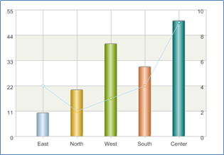
| A | B | C | |
|---|---|---|---|
| 1 | [10,20,40,30,50] | [4,2,3,4,9] | [East,North,West,South,Center] |
| 2 | =canvas() | ||
| 3 | =A2.plot(“EnumAxis”,“name”:“area”) | ||
| 4 | =A2.plot(“NumericAxis”,“name”:“amount”,“location”:2) | ||
| 5 | =A2.plot(“NumericAxis”,“name”:“quantity”,“location”:2,“yPosition”:0.8) | ||
| 6 | =A2.plot(“Column”,“axis1”:“area”,“data1”:C1,“axis2”:“amount”,“data2”:A1) | ||
| 7 | =A2.plot(“Line”,“axis1”:“area”,“data1”:C1,“axis2”:“quantity”,“data2”:B1) | ||
| 8 | =A2.draw(600,400) | ||
A4 and A5 define two vertical axes. A6 uses the coordinate system composed of A3 and A4, and A7 uses the coordinate system composed of A3 and A5. The drawn biaxial graph:
SPL Programming - Preface
SPL Programming - 12.2 [Drawing graphics] Coordinate system
SPL Programming - 12.4 [Drawing graphics] Legend
SPL Official Website 👉 http://www.scudata.com
SPL Feedback and Help 👉 https://www.reddit.com/r/esProc
SPL Learning Material 👉 http://c.scudata.com
SPL Source Code and Package 👉 https://github.com/SPLWare/esProc
Discord 👉 https://discord.gg/ydhVnFH9
Youtube 👉 https://www.youtube.com/@esProc_SPL